How to convert a logo to a one-color SVG
Create a clean one-color or reversed SVG logo for vinyl, screen printing, stamps, engraving, and single-ink production.
Quick answer
Start from the approved vector master, or rebuild the cleanest raster logo with Logo to Vector. Decide whether the production file needs a positive dark mark, a reversed white mark, or separate spot-color layers. Remove color-only distinctions that disappear in one ink, preserve essential negative spaces, merge shapes that must cut together, and test the result at its real physical size with the cut file checker.
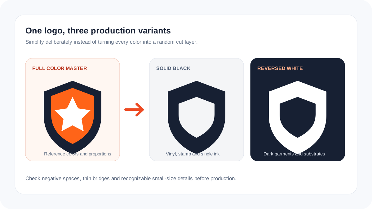
One color changes the structure, not only the fill
In a color logo, two touching regions may remain visible because their colors differ. Once both become black, that boundary disappears. A production-ready one-color version therefore needs deliberate negative space, cutouts, or separation—not a global recolor alone.
Keep the full-color master untouched. Build named derivatives such as brand-one-color.svg and brand-reversed.svg, and document which version belongs on light or dark material.
Match the variant to the process
| Process | Useful logo variant | Critical check |
|---|---|---|
| Cut vinyl | Single welded silhouette | Weeding and small islands |
| Screen printing | One spot-color separation | Ink traps and minimum line width |
| Stamp or engraving | High-contrast positive/reverse mark | Filled gaps at small size |
| Embroidery preparation | Simplified color regions | Details that survive thread |
Create the one-color SVG
- Confirm that the logo version and trademark usage are approved.
- Vectorize only when no trusted vector master exists.
- Duplicate the master and map every retained shape to one fill color.
- Use compound paths for intentional holes and negative spaces.
- Remove micro-details that cannot survive the target process, but do not redesign distinctive letterforms.
- Test black on white, white on black, and the smallest production size before delivery.
Common one-color mistakes
- Applying black to every object and losing boundaries between touching shapes.
- Leaving white objects instead of creating real transparent cutouts.
- Keeping tiny islands that cannot be weeded, stamped, engraved, or stitched.
- Replacing the approved full-color master with the simplified derivative.
Production checklist
- The silhouette remains recognizable without color.
- Counters and deliberate holes are compound paths.
- There are no hidden duplicate shapes.
- Thin bridges survive at final size.
- Positive and reversed versions were checked separately.
Frequently asked questions
Is grayscale the same as a one-color logo?
No. Grayscale uses multiple tones. A true one-color production file generally uses one solid ink or material plus transparent negative space.
Can I make white areas with white fill?
For cutting and many production workflows, intentional holes should usually be transparent compound-path cutouts rather than white objects.
Should every logo have a simplified version?
Complex marks benefit from a small-size or production-specific variant. The simplification should be approved and stored separately from the master.